Page Eight was on the BBC on Sunday, by which I do not mean “tomorrow”. A “spy thriller”, you know. David Hare did it, which would be remarkable if he were a real hare.
Bill Nighy was one of the people who were doing acting. Here he is leaving a hotel. The back of his head is distinctive.
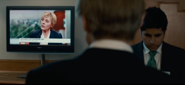
It’s nice, but I am most interested in that television set. There, we see the BBC News channel. It is quite believable, the BBC News channel blaring out in a hotel reception. On ITV, they all watch that channel’s news programmes, which would never happen in real life, but BBC drama department is friends with an actual news channel that people watch, and so can borrow things to give it authenticity. Things that make you forget it’s not the real BBC News channel, but rather a version that exists inside a parallel universe where Nick Clegg is a woman and Professor Dumbledore is a spy and Lord Voldemort writes for the Financial Times.
On the real BBC News channel, they set on-screen text in Gill Sans, just like what the BBC logo is. And on the fictional TV, true to life, we can see that “Deputy Prime Minister” is set in Gill Sans. But if you look closely, and are an irredeemable typomaniac like me, you’ll see that “Anthea Catcheside MP” is set in Arial, which is an importantly different sans serif typeface.
Sloppy work, the BBC.
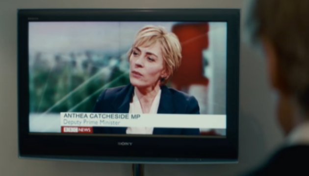
What I haven’t told you is that seconds before the frame above, we were treated to a full-screen close-up of the televison set.

In this shot, both lines were set in Arial. (Notice that the “Deputy Prime Minister” line here ends closer to the left, because Arial is narrower than Gill Sans.) Also, the BBC News logo is terrifyingly being eaten by the gods of perspective, while the other words are fine. A sudden change must happen off-camera. I’ll repeat this word: sloppy.
For comparison, I offer this picture of the real BBC News channel:
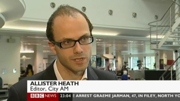
That’s all Gill Sans, and there’s even a clock and a scrolling marquee. Is that too much to ask for? (Another thing is that the bylines are far quicker to disappear, which I’m sure you can understand made my job here grabbing screengrabs very difficult, right?)
The next thing that we see is Bill Nighy shaking his head. We understand why.
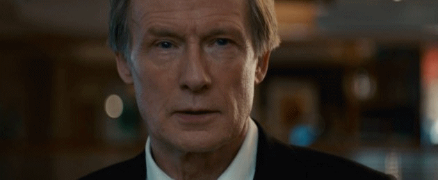
(It is a terrible animated GIF. I have never made such a one before. Sorry.)
Update: I have replaced the GIF with a higher-quality one (which also unfortunately has an enormous file size). And here is a video of the whole segment: