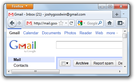
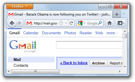
I use Gmail for doing emails, and many other people do too. It’s quite good – well, it must be, because I don’t take these choices lightly – but one fly in the ointment is the web interface’s favicon. Doesn’t it look all dirty and horrible?

Forget it, I told myself, it’s not worth it. But while I struggle to remember things like my PIN number and Clive Anderson’s surname, it’s not easy to forget such dirt and such horror, which is a rotten shame.
Then I found out that a man named Tyler Sticka, who is a proper icon designer, has made some userscripts to replace several websites’ favicons with prettier alternatives of his own design. I’m not a proper icon designer, but that trivia never stopped anyone, so I decided to have a go myself. My masterpiece is less dirty and less horrible, and more closely resembles the actual Gmail logo.

Lazily bastardising Sticka’s source code – I hope he doesn’t mind – I made a userscript, to replace the official icon with my improved version. It works with Google Chrome (natively), Greasemonkey for Firefox, and GreaseKit for WebKit, and probably other things too. Sadly, it’s not very reliable, and often the original icon will still be displayed, so I don’t know what to do. Is consistent dirty horror better than erratically flip-flopping between dirty horror and something a bit more pleasant?
All that remains is the replacement of the hyphens in the title bar with typographically correct en dashes. Then we will have solved all of the world’s problems.