-
Went to vote in the police and crime commissioner byelection. There was a huge queue, the like of which I’d never seen for a proper election, let alone a two-bit Mickey Mouse sinecure one … it seemed disproportionately whatever the opposite of a sausage fest is, and I realised that it was actually a queue to see an intimate performance by the boyband Blue. (The polling station was deserted, accessed by a carpeted ramp that creaked as I stomped fatly along it.)
-
There’s a market stall named Jake’s Kitchen, whose motto/slogan is “because cake is always the answer”. That’s bang wrong – sometimes the answer is 1914, Borussia Dortmund, or cress. But if the question is “what rhymes with Jake?”, cake is the answer, so why didn’t they call it Jake’s Cakes? It may be that some of the things they sell are technically not cake – pastries, tarts, biscuits etc – but then why is the slogan what it is?
-
Andy Burnham, Wonderwall, and have you noticed the scouse Stephen Graham has replaced the cockney Dexter Fletcher after many years as the voice of the McDonalds adverts? It’s pretty thin, but surely a newspaper columnist will tie the things together and say the ascendancy of North West England.
Week 379
-
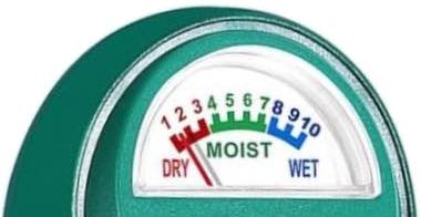
Got a moisture meter for the potted plants. The dial that goes dry • moist • wet is slightly funny. I suppose there’s a more expensive version that includes damp. The instructions are clear that the probe must only be stuck in soil, and definitely not in liquid, but it’s so tempting to find out what sort of explosion would ensue if I tried probing some wet water.
-
The heat and humidity are bit oppressive, but various evidence suggests that I don’t mind being oppressed.
-
Cherries!